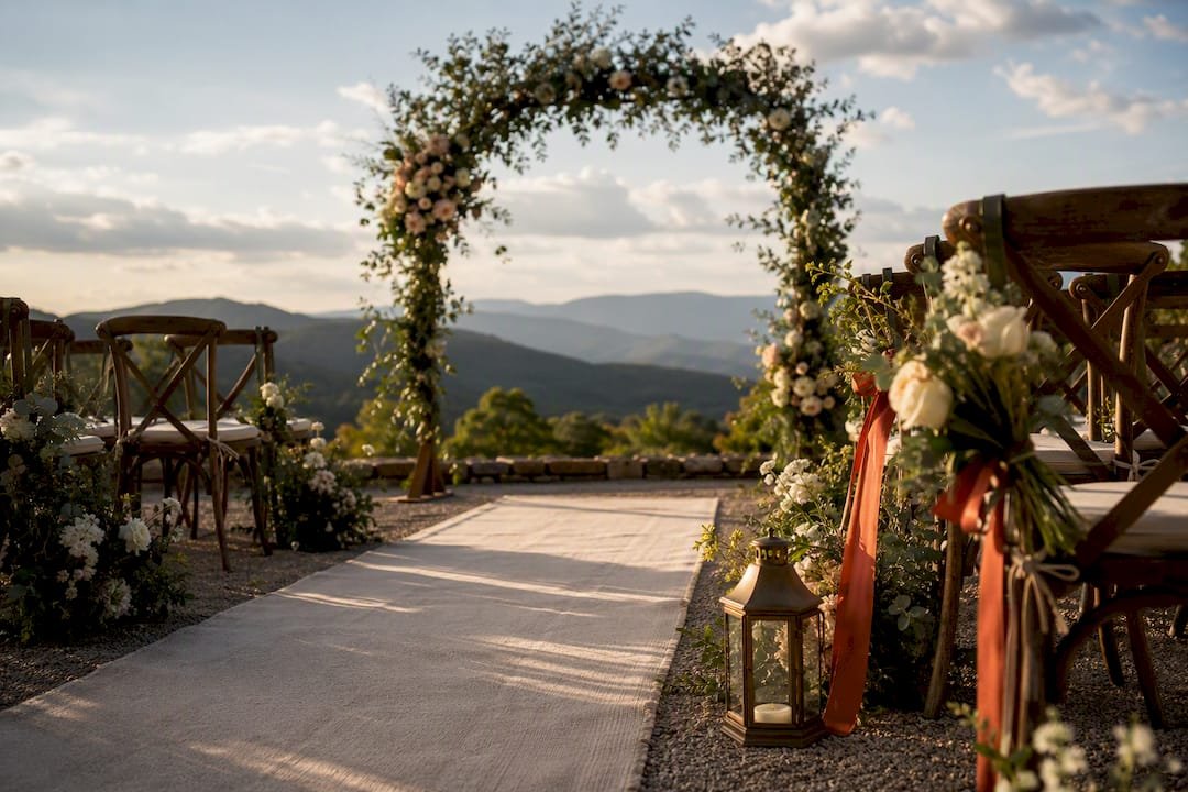
The easiest way to choose a mountain wedding color palette is to pull it straight from the terrain: pick one earthy base tone and layer in one or two seasonal accents. A spring wedding might pair sage with dusty lavender, a fall wedding leans into terracotta and gold, and a winter wedding gets its drama from evergreen and deep berry tones. Everything below builds on that foundation with real palette names, styling notes, and application tips.
TL;DR:
- Select a dominant earthy color that matches existing venue materials like wood or stone; add one secondary and one metallic accent for balance.
- Use muted, dusty, or desaturated hues for high-altitude settings to prevent colors from appearing too bright or washed out in natural mountain light.
- Plan how color shifts across the wedding weekend, with bolder tones at the welcome, softer shades for the ceremony, and complementary accents at farewell events.
- Ensure consistent color placement across florals, linens, stationery, and attire to create a unified, intentional look rather than a cluttered appearance.
- Test fabric swatches outdoors in natural lighting to assess how textures and material reflect color, especially under mountain sunlight and reflective snow conditions.
Table of Contents
- Mountain Wedding Color Palette Ideas by Season and Mood
- How to Choose the Right Mountain Wedding Colors for Your Venue
- Applying Your Palette Across Florals, Linens, Stationery, and Attire
- Why Fabric and Mountain Light Change How Color Reads
- A Sample Weekend Palette in Action
- What Your Color Choices Say About Your Mountain Wedding
- A Venue Planner’s Take on Common Palette Mistakes
- Let Cherrywood Ranch Bring Your Palette to Life
- Sources
Mountain Wedding Color Palette Ideas by Season and Mood
Every one of these works because it echoes something already growing on the mountainside, not because it looked good on a mood board. Pines, granite, water, and aspen leaves are reliable palette sources, and pairing a deep natural hue with sandy neutrals and muted metallics tends to outperform anything overly saturated when you’re standing at 3,000 feet with natural surroundings driving the color story.
- Sage and Rust. Soft sage green, burnt rust, cream, and antique brass. Best for early fall ceremonies; use rust as the accent in bridesmaid sashes, not full gowns.
- Terracotta and Gold. Terracotta, warm gold, ivory, and forest green. Works for outdoor fall receptions; pair with amber glassware and beeswax candles.
- Blush and Slate. Blush pink, slate blue, dove gray, and soft silver. Ideal for spring weddings with granite or stone backdrops; keep florals airy rather than dense.
- Lavender and Sage. Lavender, sage, ivory, and pale gold. A gentle spring option for meadow ceremonies; pairs well with wildflower bouquets.
- Evergreen and Berry. Deep evergreen, cranberry, cream, and antique gold. Built for winter; jewel-toned berries against candlelight give this palette its glow, and rustic-luxe winter styling leans hard on this combination.
- Olive and Cream. Olive green, cream, gold-rim accents, and simple greenery. A timeless summer-to-fall option that photographs cleanly against mountain backdrops, especially with olive napkins and gold chargers on the tables.
- Sandy Neutral and Deep Blue. Sandy tan, deep navy or teal, warm gray, and brushed metal. Best when your venue has water views; keep the blue as an accent, not the base.
- Dusty Rose and Charcoal. Dusty rose, charcoal, warm white, and copper. An elevated, editorial-leaning palette for couples who want romance without pastel overload.
- Amber and Smoke. Amber, smoky gray, deep plum, and brass. A bold choice for evening receptions with fire pits or string lighting; the plum keeps it from feeling too warm.
- Frost and Evergreen. Icy white, evergreen, silver, and a whisper of dusty blue. Built for true winter mountain weddings, especially with snow on the ground.
How to Choose the Right Mountain Wedding Colors for Your Venue
Start with what you can’t change. The wood beams, stone fireplace, or timber arch at your venue are permanent design elements, and your palette should harmonize with them rather than fight them. A cabin with warm honey-toned wood calls for a different palette than a stone lodge with cool gray undertones.
From there:
- Choose one dominant earthy base color that echoes something already at the venue (wood, stone, pine, granite).
- Add one secondary color and one accent, ideally metallic, and stop there.
- Assign each color a specific job: base on linens and signage, secondary on bouquets and attire accents, accent on stationery and chargers.
- Mute your saturation. High-altitude sunlight is crisper than sea-level light, so bright pigments read louder than expected, and dusty or muted versions of a color tend to hold up better in photos.
- If your wedding spans a weekend, plan how the palette shifts: bolder and more casual at a welcome bonfire, more refined for the ceremony, softer for a farewell brunch.
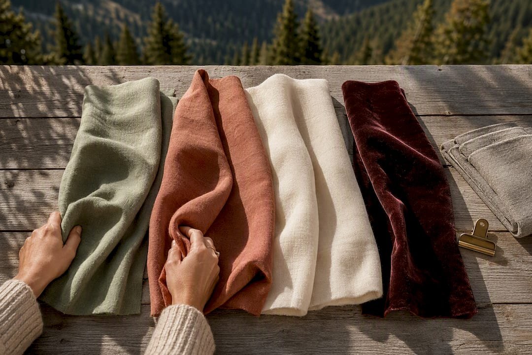
Pro Tip: Request fabric swatches, not paint chips, from your florist and rental company. A color always looks different on velvet than it does on glossy cardstock, and texture changes perceived depth more than adding another color ever will.
Applying Your Palette Across Florals, Linens, Stationery, and Attire
Once you’ve locked in a base, secondary, and accent color, the real work is deciding where each one physically shows up. Consistency across every touchpoint is what makes a wedding look designed instead of assembled.
- Ceremony backdrop: use your base color in greenery and structural elements, saving brighter accents for smaller details like ribbon or florals.
- Reception tables: linens and napkins in the base tone, chargers or flatware in the metallic accent.
- Wedding party attire: secondary color for dresses or ties, base tones for suits or neutrals.
- Bouquets: mix base and accent colors, anchored heavily in greenery so the arrangement doesn’t compete with mountain views.
- Signage and stationery: accent color for typography or borders, keeping the background neutral so it reads clearly outdoors.
Keep centerpieces low. Nobody wants a floral tower blocking a ridge line, and florists working with a mountain venue almost always recommend building texture with greenery and varied bloom sizes rather than adding more colors to the mix.
Why Fabric and Mountain Light Change How Color Reads
Velvet, wool, and linen hold color with more depth than shiny synthetics, which tend to glare under direct sun and wash out in photos. That matters more at elevation than it does at a sea-level venue, because high-altitude sunlight has less atmospheric scattering, and saturated pigments read brighter and harder than they would at home. Experienced stylists compensate by shifting to dusty or muted variations of a chosen hue and testing full-size swatches outdoors at the actual ceremony time, not in a showroom. Photographers planning around golden hour and possible snow reflectance should be looped in early, since lighting conditions at altitude can warm or cool a palette dramatically in the final images.
A Sample Weekend Palette in Action
A workable weekend palette might run sage green, terracotta, cream, and antique brass. At a welcome bonfire, terracotta and brass show up in blankets and lanterns. For the ceremony, sage takes over in greenery and attire accents against the mountain backdrop, framed well by a properly colored ceremony arch. By farewell brunch, cream and sage soften into linens and simple centerpieces. Multi-day events also mean packing for temperature swings and choosing bonfire-safe decor, both worth mapping out early in your mountain wedding weekend planning.
What Your Color Choices Say About Your Mountain Wedding
Color carries mood whether you plan for it or not. Deep evergreen and berry tones read as cozy and intimate, which is exactly why they dominate winter mountain weddings built around fireplaces and candlelight. Sage and lavender feel soft and unhurried, a natural fit for a spring ceremony where the goal is calm rather than spectacle. Terracotta and amber pull warmth and energy into a fall wedding, echoing the turning leaves without needing much added decor.
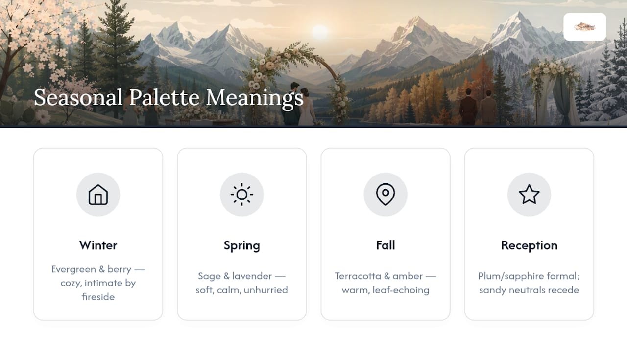
Bold jewel tones like plum or sapphire signal formality and confidence, useful if you want your reception to feel a little more elevated than your ceremony. Sandy neutrals and warm grays do the opposite. They recede, letting the mountain view itself become the visual centerpiece rather than competing with it. None of this is arbitrary. A palette that matches the emotional register you want for each part of the weekend, rather than one chosen purely for what looks trendy, tends to feel more intentional in photos and in memory.
A Venue Planner’s Take on Common Palette Mistakes
The two mistakes I see most: couples cram in four or five bright colors instead of committing to one strong base, and they choose a palette without ever looking hard at their venue’s existing wood and stone tones. Both fixes are simple. Pick one dominant color, one accent, and stop. Then hold your swatches up against the actual materials you’ll be shooting your day against, not a screen.
— Luis
Let Cherrywood Ranch Bring Your Palette to Life
Picking the right colors is only half the job. Getting them to look right across a full wedding weekend, from a welcome bonfire to a farewell brunch, takes a venue built for that kind of continuity. The venue provides outdoor ceremony and reception space, lodging for guests, and event coordination support, so your wedding palette can carry through every event without managing multiple locations.
You will have the opportunity to see how your colors look against natural mountain light before the big day, rather than only in a rental warehouse. If you’re ready to see how your palette translates across a full weekend, check availability and packages at the Cherrywood Ranch destination wedding venue page or explore lodging and weekend booking options to start planning your dates.
Sources
For dress-code guidance that pairs with earthy palettes, see Mountain wedding ideas on The Knot. For large-scale color through decor, check balloon styling ideas for receptions. For custom stationery in your palette, browse personalized place card options. For ceremony backdrop ideas, revisit outdoor ceremony styling.
- Lake wedding colors and palettes inspired by nature — Epic Thyme
- 15 cozy mountain wedding decorations with fur & timber — WeddingWild
- Mountain wedding ideas — Brides